SG.ID Seen is a regular column on Home & Decor, where we pick out some of the most interesting home interior projects completed by designers in Singapore and point out what we like about it.
Planning for a new home isn’t easy, especially when you have to factor in the possibility of new additions to the family. Just like a newborn, the spaces you conceive need to be able to grow and evolve with the needs of the family members.
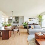
And that’s what caught our eye when we were curating our SG.ID Seen of the day. Despite being a 4-room BTO of approximately 1,022 sq ft, this HDB unit looks and feels spacious, bright, and welcoming. This project by 13th Design may look simple, but we love the attention to detail in the quality of the finishes and the thoughtful ways in which the design team took into account how the family will use the spaces over time.
One of the first things you’ll notice is the choice of a white door to go with the white walls at the entrance. We (the H&D team) often wonder why there aren’t more homeowners in Singapore who are open to the idea of opting for a white door, because it brightens up the entrance foyer and creates a more elegant entryway.
At the same time, the design team also used fluted panels on the side wall to conceal what could be the storage area or the bomb shelter. Here’s our video of another homeowner who concealed his bomb shelter by turning it into a shoe closet.

Next to the wall in the entrance foyer, we see a vertical pane of mirror, which helps to open up the area, which happens to be a corner jutting out into the living area. By doing so, not only do you get a functional area to check yourself before heading out, but you also create the impression of a larger room by concealing the corner. Quite clever indeed.

The look of the shoe cabinet below the mirror is elevated by built-in lighting.

Downlights were used in the living area to accentuate the statement wall in the living area. The dramatic lights help to bring out the natural veins of the wood texture on the wall. In addition, a standing lamp was also used to provide ambient lighting to lower the feel of the ceiling. The homeowners used darker-colored furniture to contrast with the light and earthy-toned interior. By using primary colors of blue and green for the sofa and coffee table, the whole look feels harmonious and casual, but fresh and enduring at the same time.

Opposite the sofa is more storage area, but this time the wall panels are finished in chalkboard finish, allowing the younger ones in the family to unleash their creativity all over them. There’s also a cozy little work corner with high chairs, where the homeowners can spend time with the family even while catching up on some work. We like the well-thought-through concept of using grills in a similar finish to conceal the air-conditioner. It’s a great solution for hiding the wall-mounted units.

Notice how the corridors leading to the rooms are also painted white, to keep the focus on the main living area as well as the dining area. So if you want to have lots of colors in your living space, try keeping the corridors plain so there’s space for the eye to ‘breathe‘ as you move through the home.

Turning towards the dining area, you can see that the homeowners went for a long table and bench combo paired with a couple of dining chairs to create more space along the entryway. From our perspective though, we would have preferred to enhance the sense of symmetry by using the same benches on both sides of the table. But the decision was probably also because they wanted to avoid children accidentally knocking into the sharp sides of the bench, which also makes sense.

The kitchen is finished in navy blue panels so that it wouldn’t look like a random extension of the dining area. This is a great way to bring together the look of a small-ish kitchen, making it look larger because of the visual contrast between the white walls in the living area and the blue theme.

We’re impressed by the studio’s carpentry and finish, as well as attention to detail. The curved corners of the kitchen counter are not only beautiful and sophisticated-looking, they also lower the risk of children hurting themselves when they bump into the corner.

In the master bedroom, the mattress sits on an elevated platform accented by cove lighting. This tier-ed look adds a sense of depth to the room itself, and also creates a space that can be converted into a vanity and storage area.

The wall next to the door was transformed into a row of custom-built wardrobe cabinets. We like the spatial planning here, although we would have wanted lighting along the headboard to extend around the border.

Fortunately for the homeowners, the height of the ceiling in this BTO unit is high enough to allow for a platform design. Some older resale flats do not have high ceilings, although they make up for it with more floor space.

Again, the look would have been perfect if the lighting along the headboard continued through the length of the paneling and down the side. At the same time, if they had created a curve in the lower wall similar to the curved look of the headboard, the entire look would have been more seamless. Nonetheless, it’s still a very cohesive design.

The master bathroom looks indulgent and suave with the large mirror flanked by two accent pendant lamps.

For the baby’s nursery, the couple decided to keep things simple by using various over-the-shelf storage solutions. This way, the layout of and items in the room can vary accordingly as the child grows older.
So for young families starting, this makes for a splendid home. Kudos to 13th Design for the efforts to create a beautiful nest for this expanding family.