We’ve seen many interior decorating trends emerge throughout the course of 2016 and as much as we loved covering them, it’s time to retire some that have been over-used and at times abused by the over-enthusiastic styling buff.

1: Serenity blue
Early last year the world renowned colour specialist Pantone named Serenity blue (pantone 15-3919) as colour of the year, along with a muted pink hue called Rose quartz (pantone 13-1520). Yet while rose quartz continues to exude appeal over homeowners and designers, the same cannot be said of Serenity blue and the various furnishing and accessories dressed in said hue. What has become apparent is that over time a watered-down blue colour runs the danger of looking tired and dated. So the light blue accessories that made your interiors look airy and bright initially have taken on a patina of fatigue and (dare we say it) boredom.

2: Copper accents
Metallic finishes will always have a place in our hearts, but when it comes to copper accents, homeowners need to be more discerning in their choices. When copper accessories became a ‘thing’ in the interior decorating circles around mid-2015, the market was soon flooded with a barrage of copper accessories. The problem was many lower-end versions were just plastic replicas, which came in cheap-looking copper-toned coating. Thankfully many designers and stylists have moved on from using copper accents. Expect to see an evolution of the trend however, into metallic accents that come in dark coatings or burnished finishes.

3: Quote posters
Modern calligraphy is catching on with the millennials, who adore the whimsical look of the new cursive writing style. But when it comes to home decorating, it’s best to keep the inspirational quotes in your mind and out of sight.

4: Marble accessories
As a look, use of marble accessories was the height of sophistication in 2016, partly popularised by cult magazines, such as Kinfolk and Monocle. Vases, penholders and vessels carved from marble gave the home a post-modern vibe sought after by many urban homeowners. But having a good run in the past 12 months only means it’s time to move on before one runs out of space to store those chunky and heavy pieces. In 2017, the sentiment among designers is to use lighter materials like terracotta and wicker, to create forms that have more slender silhouettes and evoke a more spacious feel.

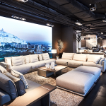
5: Wide open spaces
Apartment homes with an ‘open-plan’ look are a dime a dozen now, and homeowners need customised layouts that reflect their individuality and meet their needs. What we’ll see happening in 2017 is that more home layouts will have integrated living spaces that are spatially segmented by different flooring treatments or wallcoverings. In addition, large open spaces will also be broken up with the use of full-height and see-through shelving units. This way, it allows the spaces to remain visually connected while also creating cosy corners where its inhabitants can go to for privacy.